Visualize a Standardized Mean Difference With Overlapping Distributions
Source:R/plot_smd.R
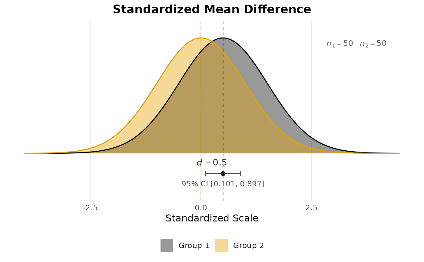
plot_smd.RdCreates a publication-quality plot showing two normal distributions separated by the standardized mean difference (d). The plot includes a confidence interval for the population effect size and sample size annotations, both shown by default.
Usage
plot_smd(
  smd = NULL,
  n_1 = NULL,
  n_2 = NULL,
  group_1 = NULL,
  group_2 = NULL,
  conf_level = 0.95,
  show_ci = TRUE,
  show_n = TRUE,
  title = NULL,
  group_labels = c("Group 1", "Group 2"),
  palette = "okabe_ito",
  colors = NULL
)
Arguments
- smd
The standardized mean difference (Cohen's d).
- n_1
Sample size for Group 1.
- n_2
Sample size for Group 2.
- group_1
Raw data for Group 1. When provided,
smd,n_1, andn_2are computed from the data.- group_2
Raw data for Group 2.
- conf_level
Confidence level for the confidence interval (default
0.95).- show_ci
Logical. If
TRUE(the default), a confidence interval for the population standardized mean difference is displayed beneath the distributions. Requires bothn_1andn_2.- show_n
Logical. If
TRUE(the default), per-group sample sizes are annotated on the plot.- title
Optional character string for the plot title. Defaults to
"Standardized Mean Difference".- group_labels
Character vector of length 2 giving labels for the two groups. Defaults to
c("Group 1", "Group 2").- palette
Character string naming the color palette used when
colorsisNULL. Defaults to"okabe_ito", base R's colorblind-safe Okabe-Ito palette;"tableau"is also available.- colors
Optional character vector of length 2 giving fill colors for the two groups. When
NULL(the default), the first two colors ofpaletteare used.
Value
A ggplot2 object that can be further customized with standard
ggplot2 layers, scales, and themes.
Details
Two unit-variance normal distributions are drawn, centered at 0 (Group 2 / reference) and d (Group 1 / focal). The semi-transparent fills make the overlap visible, giving a direct visual impression of how much the distributions differ.
When show_ci = TRUE and both n_1 and n_2 are available,
the function calls ci_smd to compute the noncentral t
based confidence interval and displays it as a horizontal bar beneath the
curves. A filled dot marks the point estimate and vertical caps mark the
confidence bounds.
References
Cohen, J. (1988). Statistical power analysis for the behavioral sciences (2nd ed.). Hillsdale, NJ: Lawrence Erlbaum.
Kelley, K. (2007). Confidence intervals for standardized effect sizes: Theory, application, and implementation. Journal of Statistical Software, 20(8), 1–24. doi:10.18637/jss.v020.i08
See also
Other plotting:
plot_R2(),
plot_cfa_k(),
plot_ci(),
plot_equivalence(),
plot_forest(),
plot_irt_information(),
plot_mediation_mbco(),
plot_randomization_test(),
plot_regions_of_significance(),
plot_trajectories(),
plot_trajectories_fitted(),
power_equivalence_md_plot()
Other confidence intervals for effect sizes:
ci_R2(),
ci_c(),
ci_c_ancova(),
ci_c_ancova_bp(),
ci_correlation,
ci_cv(),
ci_eta_squared(),
ci_eta_squared_generalized(),
ci_eta_squared_partial(),
ci_mahalanobis(),
ci_omega_squared(),
ci_pvaf(),
ci_rc(),
ci_reg_coef(),
ci_rmsea(),
ci_sc(),
ci_sc_ancova(),
ci_sm(),
ci_smd(),
ci_smd_c(),
ci_snr(),
ci_src(),
ci_srsnr(),
contrast_adjusted()
Author
Ken Kelley kkelley@nd.edu
Examples
# From a known effect size and sample sizes.
plot_smd(smd = 0.50, n_1 = 50, n_2 = 50)
 # The variations below are not run, since the call above already shows
# the default display and each additional figure has to be drawn. From
# raw data, where the standardized mean difference and both sample
# sizes are taken from the data:
# set.seed(113)
# g1 <- rnorm(40, mean = 0.6, sd = 1)
# g2 <- rnorm(40, mean = 0.0, sd = 1)
# plot_smd(group_1 = g1, group_2 = g2)
# Without the confidence interval or the sample size annotations:
# plot_smd(smd = 0.80, show_ci = FALSE, show_n = FALSE)
# Custom group labels and title:
# plot_smd(smd = 0.45, n_1 = 75, n_2 = 75,
# group_labels = c("Treatment", "Control"),
# title = "Treatment Effect on Reading Scores")
# The variations below are not run, since the call above already shows
# the default display and each additional figure has to be drawn. From
# raw data, where the standardized mean difference and both sample
# sizes are taken from the data:
# set.seed(113)
# g1 <- rnorm(40, mean = 0.6, sd = 1)
# g2 <- rnorm(40, mean = 0.0, sd = 1)
# plot_smd(group_1 = g1, group_2 = g2)
# Without the confidence interval or the sample size annotations:
# plot_smd(smd = 0.80, show_ci = FALSE, show_n = FALSE)
# Custom group labels and title:
# plot_smd(smd = 0.45, n_1 = 75, n_2 = 75,
# group_labels = c("Treatment", "Control"),
# title = "Treatment Effect on Reading Scores")